Logo identity for Sugarbush UK
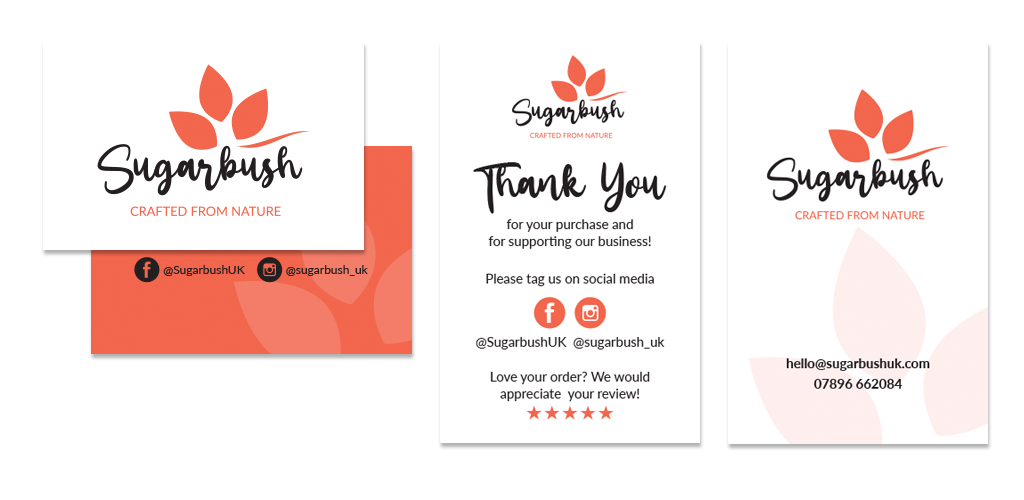
Sugarbush specialises in handmade cosmetic products made from carefully chosen ingredients, selected for their benefits to your skin. They only use ingredients that are necessary and natural wherever possible. Being a startup business, we designed the logo, a simple brand guidelines document, email signature, business and thank you cards.
The name Sugarbush stems from the South African national flower Protea, which offers richness and diversity, qualities and heritage that aligns with the the brand Sugarbush UK.
With values like natural, simplicity, transformation, honesty and innovation, we designed a clean and simple logo identity taking inspiration from the Protea flower for the shapes and colour. Using a handwritten style typface gives the name a personal touch.
The strapline ‘Crafted from nature’ hints that the products (which are all handmade) are crafted from natural ingredients.
You can find out more about Sugarbush UK and their lovely products by visiting their website sugarbushuk.com.

